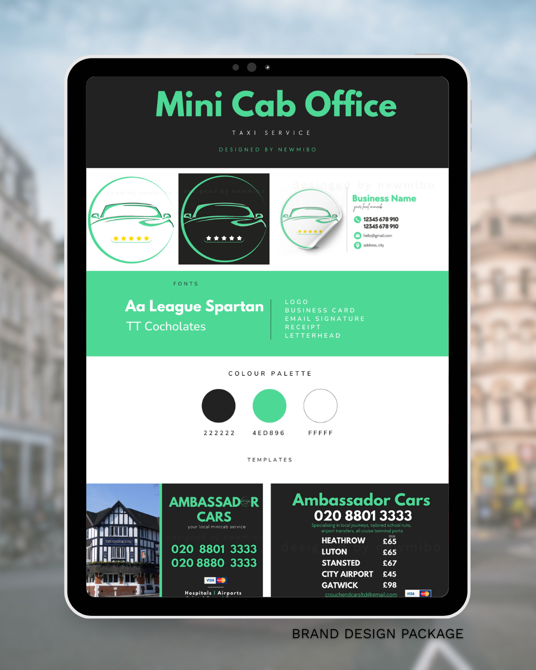
Mini Cab Design – Bold & Modern
This rebranding project was developed for a local cab office looking for a clean and modern identity. The goal: a bold, instantly recognisable design that puts essential contact details and services front and centre.
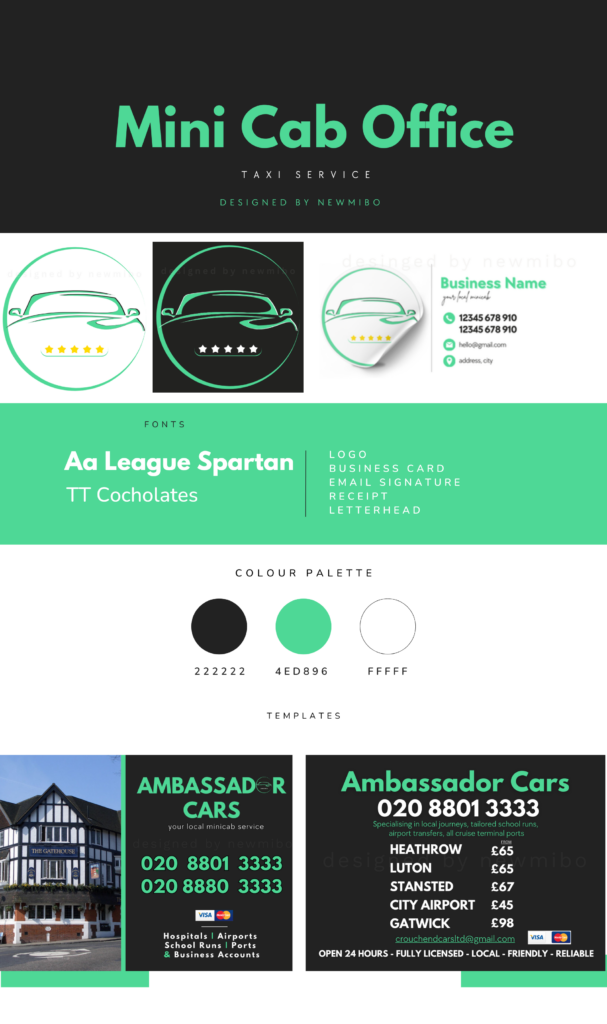
The primary colour—green —was chosen for its vibrancy and visibility, balanced with white and dark grey for contrast and readability. The typeface League Spartan reinforces the confident, contemporary look across all materials.
🎯 Project Highlights:
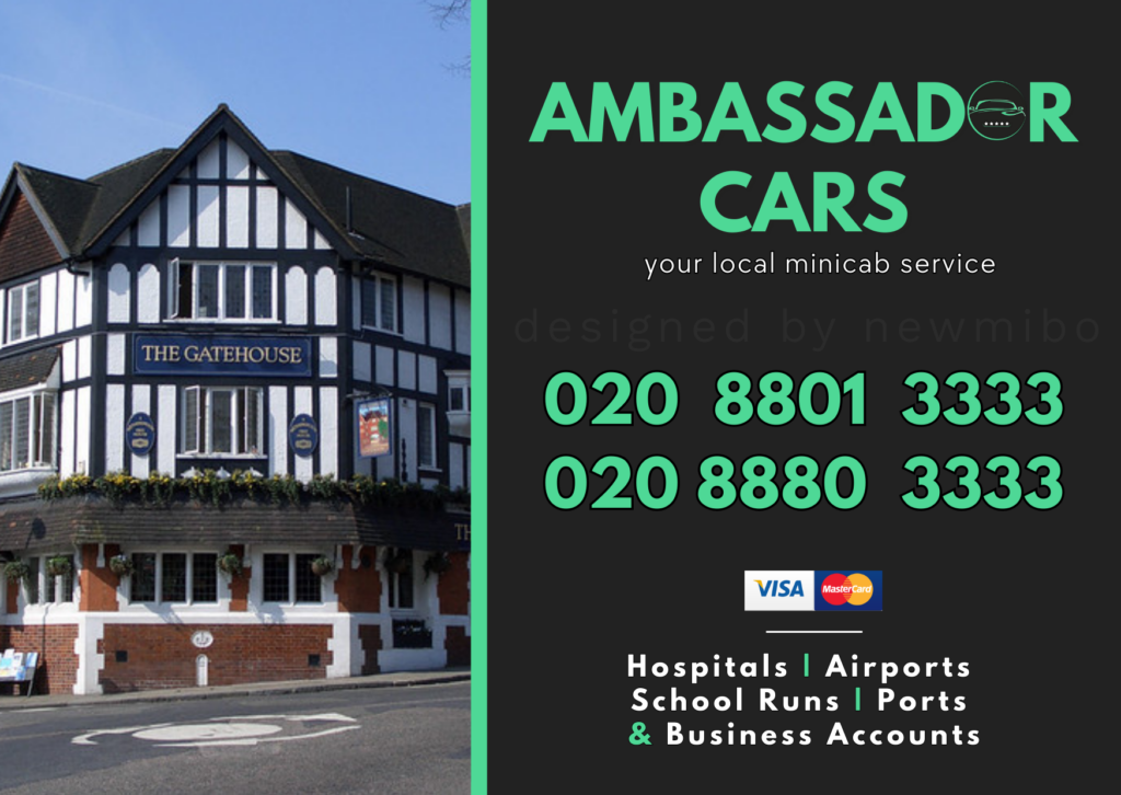
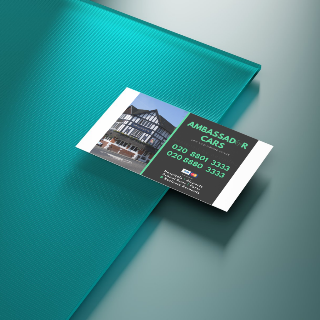
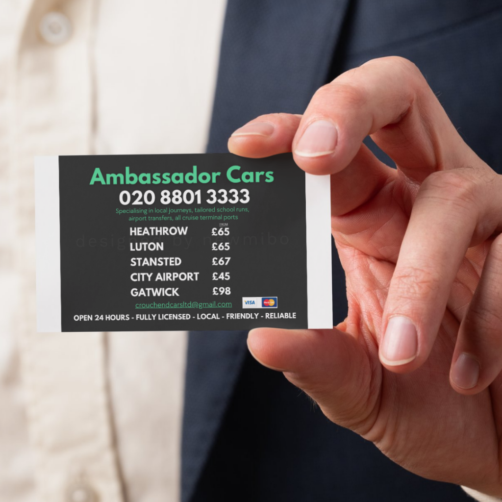
- Business Cards (Front & Back):
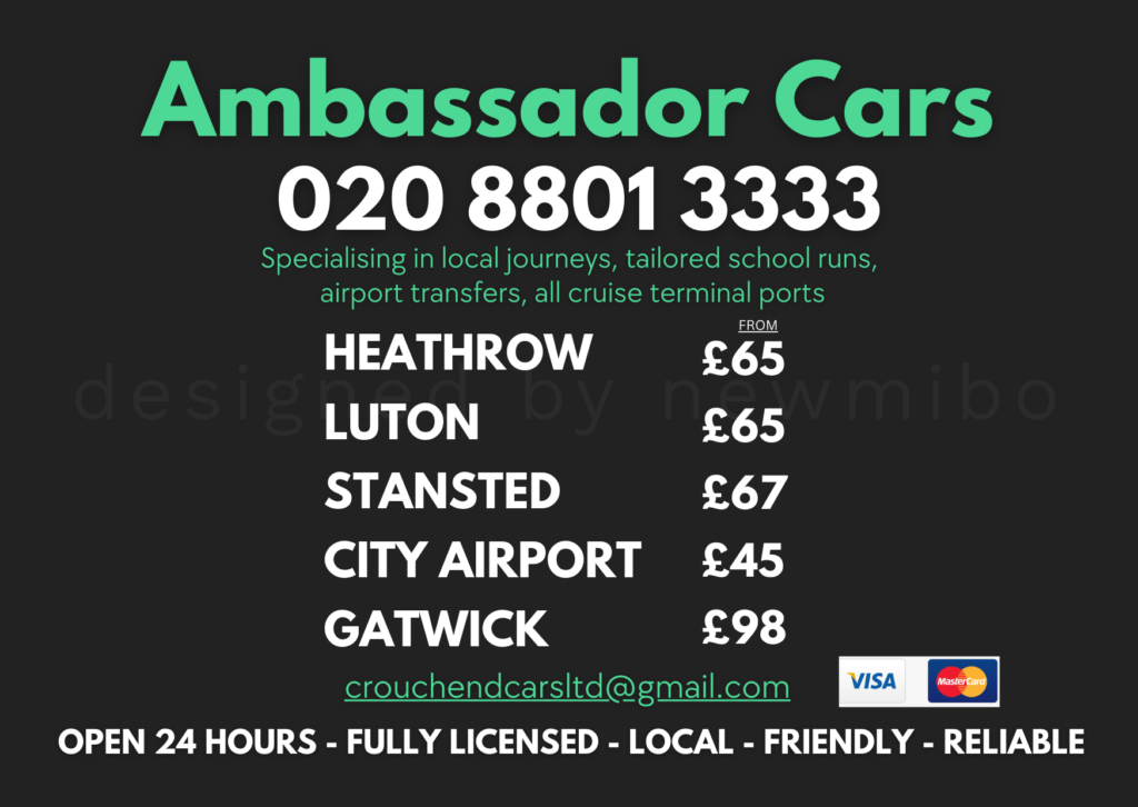
Designed with clarity in mind. The front features prominent contact info, while the back includes airport pricing—something the client specifically wanted to promote. Bold type and strong layout make it easy for customers to grab and go.
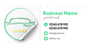
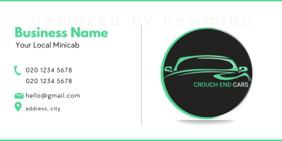
- Logo Variations:
Created both light and dark versions of the logo for flexible use across print and digital — from business cards to WhatsApp profiles.
- Email Signature:
A branded signature with consistent styling, making every customer interaction look sharp and professional.
🧩 Design Details:
- Colour Palette: Green, White, Dark Grey
- Font: League Spartan – clean, bold, easy to read
- Design Style: Minimal, modern, focused on visibility and function
📸 See the Package in Action:
Scroll through the mockups to view the full visual identity — including the colour palette, business card designs, and email signature layout.
💡 Need a Similar Look?
This style can be adapted for other small businesses — from removals and handyman services to local shops and salons. We always begin with a clear colour palette and typography to ensure consistency across every element. Once the core branding is in place, it’s easy to expand with additional materials like invoices, leaflets, or signage — all in the same cohesive style.
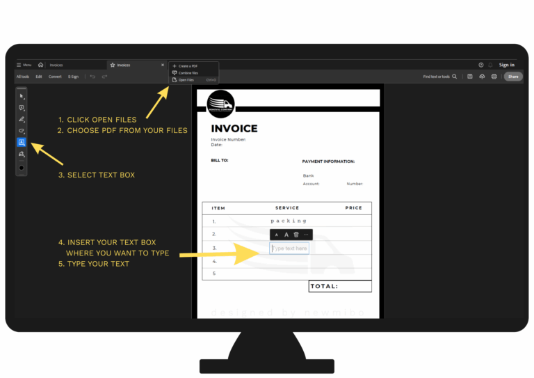
Need help using your templates?
I’ve compiled a simple step-by-step guide to help you download, edit, and make the most of your designs. Read it here →